Lifetime
Project Runway All Stars Spaces Out For The Avant-Garde Challenge
The cosmos are the inspiration for the Runway franchise's latest attempt to make fashion into art. Whose looks were out of this world, and whose were a waste of space?
Our Players
The Talk
Sarah, are you psychic?! Because you predicted that this week's avant-garde challenge would suffer from ill-defined parameters and by God, you nailed it! I actually can't believe they didn't edit out the moment toward the end of the judging when Isaac says, "I think Joshua's is one of the ugliest things I've ever seen, so maybe it should win...I can't tell; you know, like, if it's avant-garde, it's so-- such a weird--" and Georgina interrupts to muse, "But does 'avant-garde' mean ugly? I don't think so." HEY, MAYBE IF YOUR JUDGES DON'T KNOW HOW TO JUDGE IT, THERE ARE STRUCTURAL PROBLEMS INHERENT IN YOUR BRIEF.
I liked that we got more of the judging than usual -- and that it was pretty sugar-free compared to how gentle they generally are with the designers present -- but: show, until you can find an FIT instructor who can explain what avant-garde actually means, and convince Professor Ava N. Tgarde to hang out for the runway? Maybe just...stop doing an avant-garde episode. Not that that would really have prevented Joshua from making a...jizz bedspread with chaps? Or whatever that was? But at least they'd have the right words to talk about it with.

Joshua's definitely deserved to be in the bottom, but given how the glue overlay looked during the construction process, I didn't entirely hate it when it walked. Though that just may be because guest judge RuPaul called it "next-level gay shit," because then I was just picturing RuPaul wearing it. RuPaul could have made it work! Hell, Joshua's model almost did. There was no redeeming Kimberly's, though, and she knew it. (She also knew she had one last chance to plug her online store: nice hustle, madam.)

The judges' rationale for keeping Joshua made sense to me, especially since I'm pretty sure I have already seen L'il Kim wearing Kimberly's exact outfit in a pink colorway. "Loud" isn't the same as "new." And you could just as easily dismiss Joshua's with the same observation, but he did have an idea and he did execute with unusual material. Mostly I'm relieved my man Fabio didn't go home; that Buffalo Bill's Wild Frozen West In Space look wasn't the worst, but for him it was a bed-shitter, and he knew it.

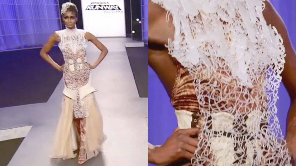
And again, unlike Kimberly's, Fabio's demonstrated a mastery of technique (in the quilting), even if the look as a whole ended up...I mean, I can't top "Buffalo Bill's Wild Frozen West In Space"; my reference was "nursing home bedspread," which I'm pretty sure is not what Fabio was going for. Which of these looks did you like? Personally, I have thought Merline should have been eliminated at several points earlier than this, but I loved her dress (not for nothing, another one RuPaul would look gorgeous in).

Agree on Merline across the board. That fabric looks so cool! I couldn't stop staring at it. The judges put The Merline Issue ("coming soon from John le Carré!") right out there this week, though: Georgina worrying that she's a one-trick pony, Isaac complimenting the trick itself. That's what it always comes down to with her, that she's very good at a certain thing but that thing doesn't fit all the challenges. Kind of like black satin, Ken. ...That's meaner than I feel; I liked his look, despite a certain unfortunate resemblance in shape and seaming to my giant foam tomato costume. But enough with that fabric, hon. It doesn't read and it's making you look scared.

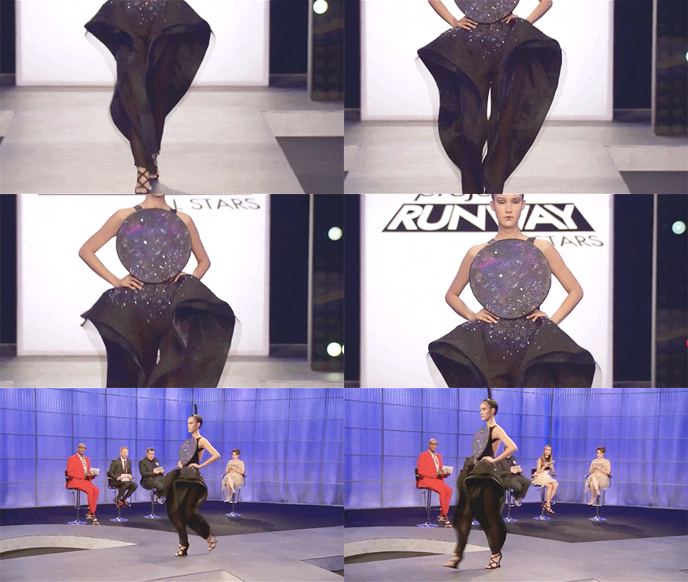
I appreciated that Ken tried to do a silhouette that would look striking on a red carpet if the right extremely confident person were to wear it -- Rihanna? -- but you're right that black is an extremely safe choice given the boldness of the concept. And at least Rih could take it off to watch a movie or sit through an award show once she got into whatever event she wore it to; Anthony's girl is going to be holding a tray in her lap, disappointing everyone who thinks it might be holding canapés.

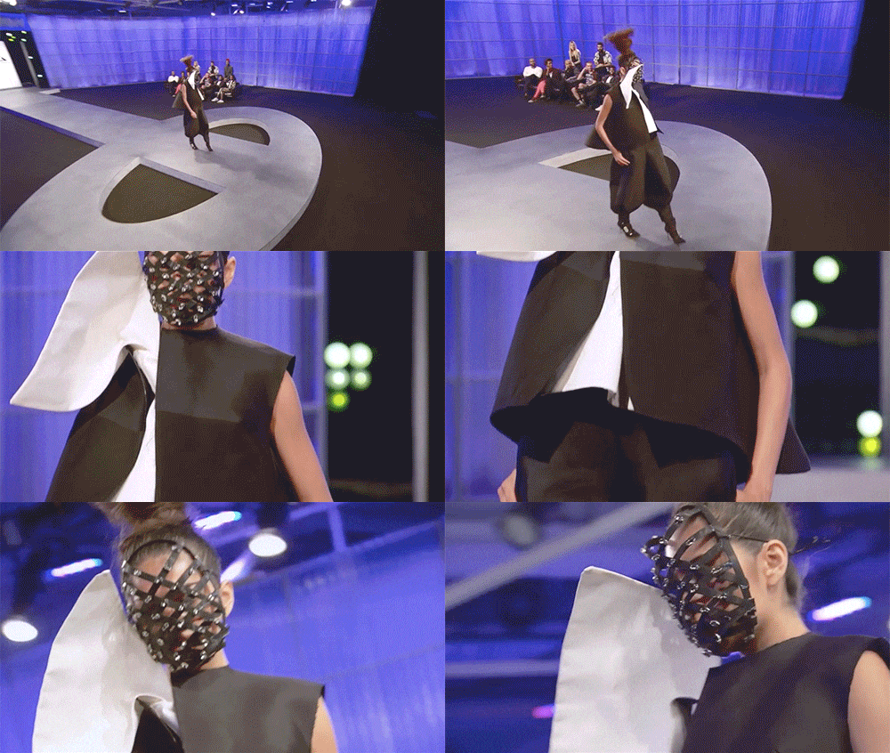
I found Anthony's kind of boring, but that's not really his look, so much as a tendency in this episode each season for the designers to go for the same "new" shapes (a swoopy shoulder; a massive blocky hip) over and over. And I actually liked the disc front the best of all the look's elements. Like, if it were detachable? And then you could sit on it if the grass is wet at a picnic? A picnic you packed in Stanley's model's face cage, I guess, and with the exception of the face-scinator, honestly, that one didn't wow me either.

I'm with you: the mask had to do all the work of making it look edgy when to me it was just Cossack, But Make It Fashion. I can't believe he won. Merline was robbed!
Which I guess is where the mask actually came in.