
Lifetime
Is Project Runway's Transitions® Lenses Challenge A Sight For Sore Eyes?
A blacklight is employed for purposes other than exposing hotel room filth in this week's challenge; your editors discuss!
Our Players
The Talk
Tara, I thought the designers did a pretty good job with yet another challenge that seemed 1) awfully artsy-craftsy for a fashion-design competition and 2) to exist primarily to promote the fustiest sponsor yet, Transitions® Lenses -- but the judges missed the mark in the looks they selected for top-three consideration, particularly Lady Cornelius's facile "emoji" "print." (That it spawned another "Instagram moment"-type comment from Nina doesn't help. "Pop culture" is...not an insight.)
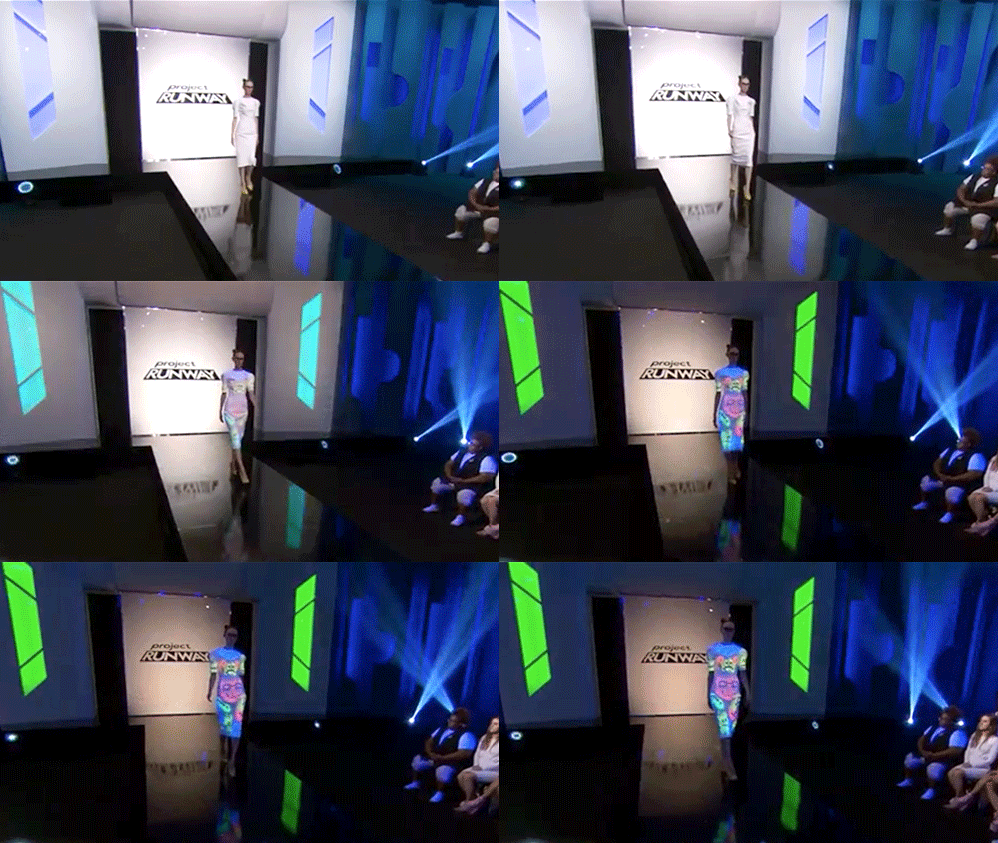
I make this judgment without intending a pun on Cornelius's name: his look was really corny. Yes, he met the brief by creating a dress that was markedly different under the blacklight and not, but the dumb emojis he chose to decorate it with looked so stupid! I wouldn't get a t-shirt in that print for my eight-year-old niece, so I doubt there are a lot of adult women who would want to wear it. However, I think their top three picks were kind of bullshit. Erin won with a dress that was, admittedly, unexpected, and the textile she created was beautiful, but I found the silhouette very unflattering even on her teeny model. What did you think of that one?
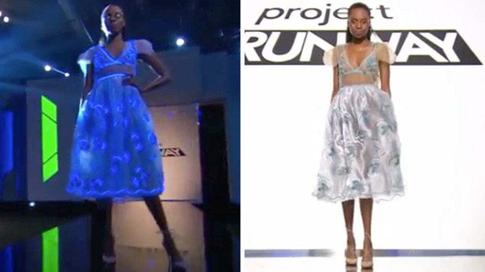
I liked it a lot; the textile looked great in both lights. I agree the profile's a bit maternity -- and ol' Corny's print aside, I did like the cut of his garment and how it contrasted with the print -- but the textile is so pretty. She has a great eye. That said, that's as much art skills as it is clothing design, and I'd say the same of Jenni's. I loved the flowers on her raincoat/varsity jacket thing, but it read kind of crafty, and did you notice she nicked Dexter's leg-bracelet shteez for the runway? With good reason, because it's cool, but it's also burnt if someone else did it before.
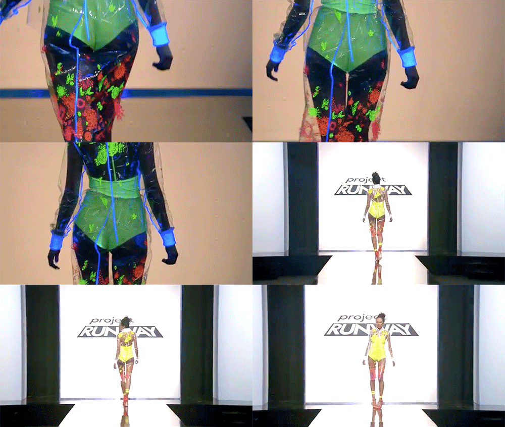
I didn't, but good eye! Jenni's was not my favourite but I guess I can understand why the judges thought it was a top three look: it's very editorial and would look super-cool in a magazine spread. But once again, this is a challenge where it's not clear to me whether the goal is to create an exciting editorial moment, or a wearable garment for someone who's not trying to look like an asshole. My main critique of this week's top three, though, is WHERE WAS ROBERI? To me his look was far and away the coolest.
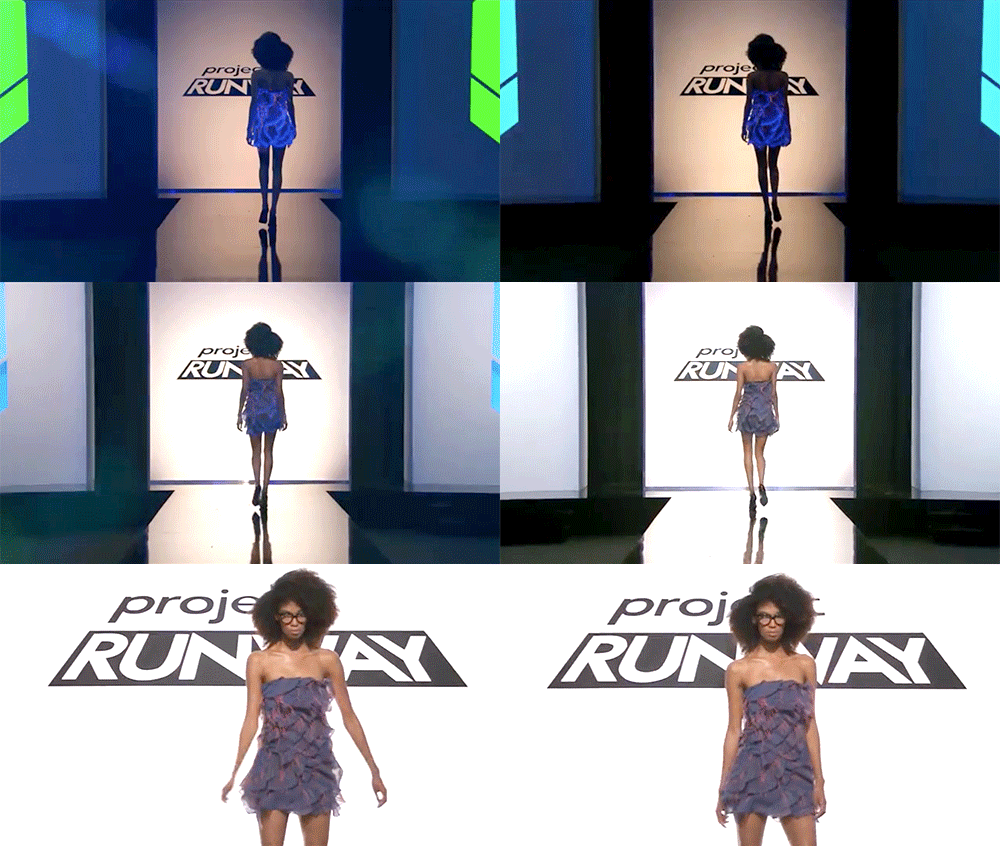
THANK you! Granted, the edging thread effect is mostly a lucky find, but that outfit is so cute and chic. I'd also put a word in for Nathalia, though I don't share her aesthetic generally; her look had this steampunk/b-girl thing going on that I really liked, and the outfit felt cohesive and confident.
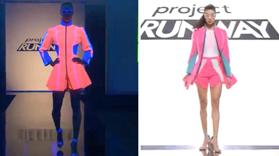
I agree, and that coral pink popped so well on the runway, though the crotch on those shorts would have definitely gotten some notes if she had made it to the critiques. How about the bottom looks? I thought Kimber's look -- the eventual loser -- was boring and also barely met the challenge brief...
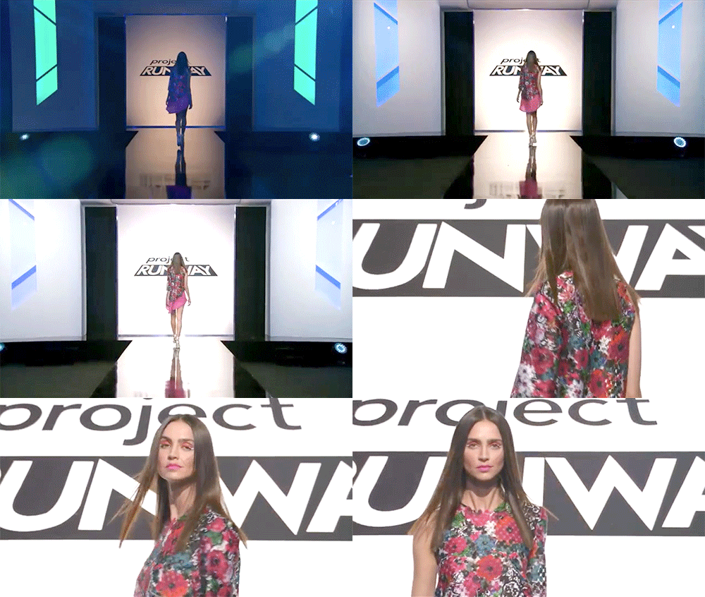
...but was it worse than Brik's? Who somehow was safe this week? He sent his model down the runway in a garment that looked like it was made out of styrofoam packing forms AND didn't change when the blacklight hit it. I guess the judges were just bored of threatening him with an auf and gave him a reprieve for a change.
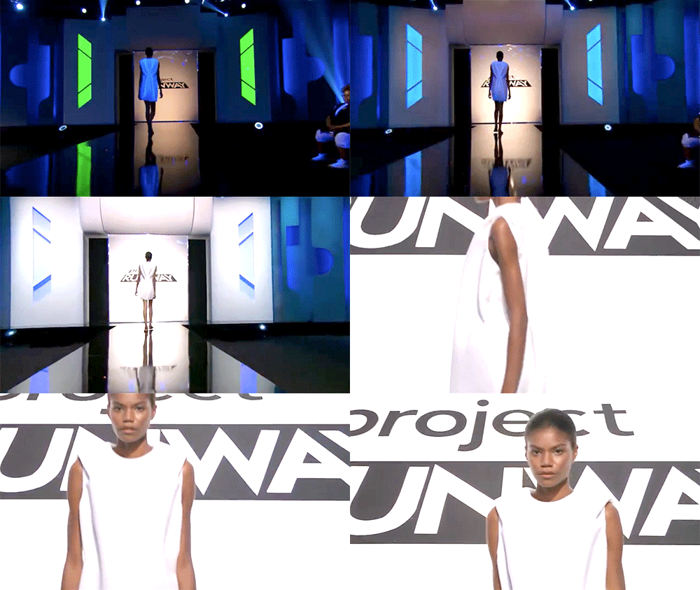
My notes, on Brik AND Laurence's: "I don't get it." Brik finally sent a silhouette out from this decade, but the cocoon shape is not exactly cutting-edge. Laurence's is flat-out weird. An orange blazer paired with a panty with a strip of marking tape on the booty? It's like a ZZ Top video filmed in the Elie Tahari section of Macy's.
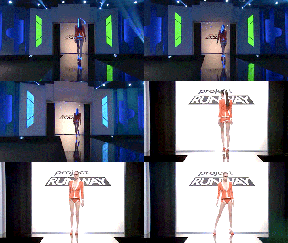
I literally could not make sense of Laurence's look. Was it...a swimsuit...with a matching blazer? Because hot pants are fine, but those weren't pants, they were briefs. I'd love to know whether hers would have been a bottom (heh) look if she didn't have immunity from last week. But back to the actual bottom three looks: Rik needs to light a candle to his patron saint, because if I had been a judge, I would have sent him home for sure. Poor guest judge Jamie King looked like its trashiness hurt her. Like, physically.
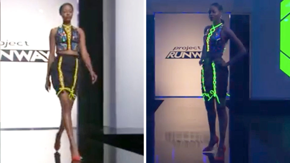
Same. My notes for that one read "athleisure dominatrix," and if Heidi is shocked at how much dupa she's seeing, you done fucked up. That said, it seemed to be shaping up much more tastefully in the workroom than what we ended up seeing, so I have a feeling Tim Gunn put his two cents in in that regard during judging. I didn't have a problem with Rik staying; I think he can come back from this, and I think Mah-Jing can too. That look is an amateurish mess, but it actually could have become something if he'd pushed that weird mix of Victoriana and luminol blood splatter further. Like, just go all the way there. Jenni is proof that the judges respond to a story.
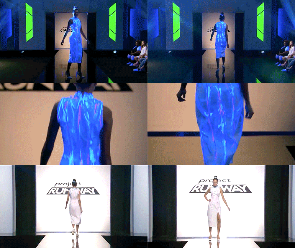
And...
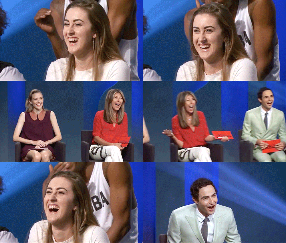
...to an extremely distinctive laugh.