Lifetime
Project Runway Throws A Party, And Tells Designers To Dismantle It And Salvage Unconventional Materials
Season 15 starts in the deep end of the pool, after producers throw the designers in there. Who sinks and who swims?
Our Players
The Talk
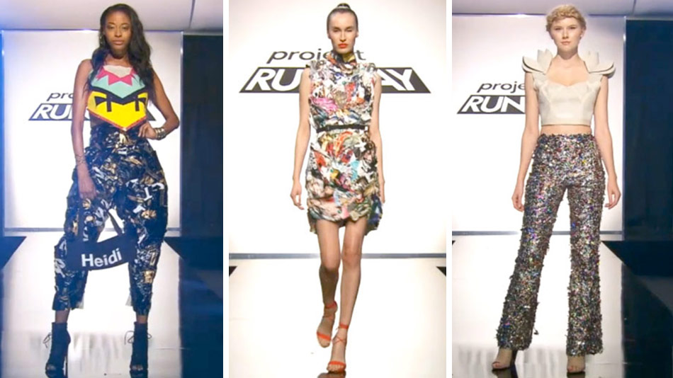
I ended the last season of Project Runway quite dispirited about the state of both the show and of contemporary fashion design in America. But I'm about to make a statement I will probably regret sooner rather than later: I was REALLY IMPRESSED by this season premiere. Particularly given that producers just went ahead and started with the unconventional materials challenge, this group of designers stepped up with a lot of inventiveness and confidence -- so much so that while I liked the three looks that ended up in the top, I could point to many more that were judged merely safe that I might have put there instead. Did you think so too, or am I nuts?
Yes! ...Hee. I had no expectations for Season 15, especially after I ended the previous season wondering if I wanted to keep watching and how Tim Gunn turned into such a bitter pill -- but Tim has new glasses and, I hope, his old gentle attitude, and I really liked the premiere too. I liked the mix of big personalities in the S15 crop of hopefuls; I like how much less white the workroom is; and I was very impressed with the results on the runway. I don't think we've ever seen an unconventional-materials challenge this competent.
I think you're right! Granted, producers stacked the party with lots of baubles and trinkets that could be put to creative use (and it's certainly possible that a few of the designers figured out what was coming when there was just a straight-up container of glitter hanging around); I was a bit surprised that two of the pillow covers ended up in the top three, since those were among the most obvious materials used in the looks that walked. But...Erin's gumballs. And inside out wigs. You have to admire the chutzpah AND how well it came out. A very well-earned win.
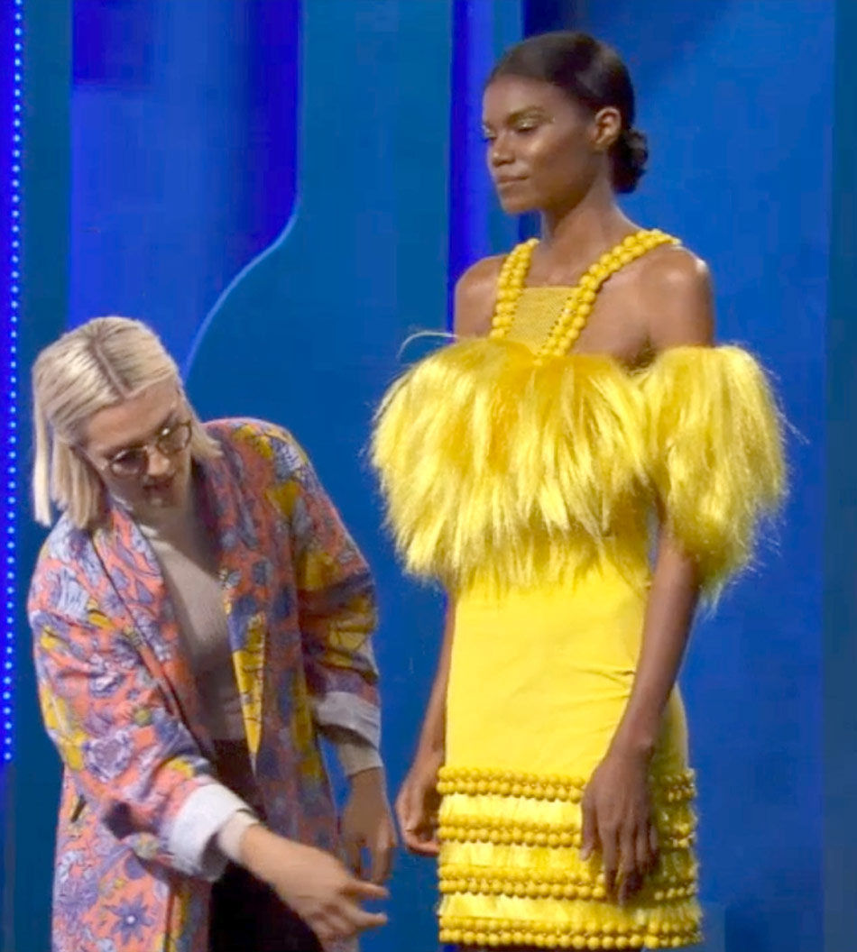
She played that yellow SO smartly. The ruff, which had a vintage feel to it; her "two crazy and one chill" theory of textures and colors and shapes. She and others seem better equipped than recent casts to talk about what they're trying to do. Not...all of them, though. Oh, Ian.
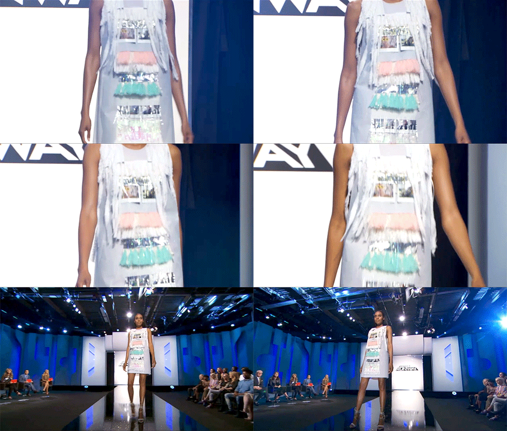
"Defensive" is never the play during crit. I think they might actually have kept him if he'd been more open to the comments, although I don't agree with Nina that the look was "elegant." It was a sitdown-strike nothing, Neen.
I couldn't agree with you more. He made it so easy to eliminate him! You can't go into a competition like this with such rigid rules about what you will and won't do, and at this late date in the show's run, if you don't come in with some idea of what you might do when -- not if -- the unconventional materials challenge comes up, you shouldn't even apply. Also, what kind of weirdo designer hates volume? Just on principle? It's fine to have an aesthetic, but if all you want to do is design shifts, why are you here?
Let's back up to those pillows. Did you agree with the judges that they were both top three looks? I was impressed by how quickly Tasha threw those pants together...
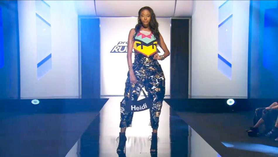
...but I thought Dexter's was the better use of that pillow print, just in terms of ambition.
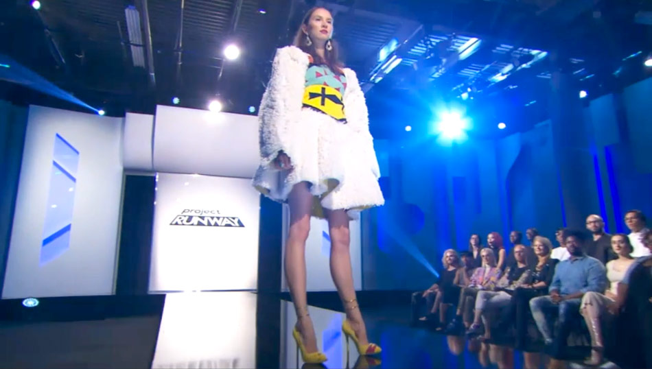
I loved Dexter's look and was relieved it was on the top -- but it was overpraised, imo. I feel the judges were responding more to the bracelet cuffs on the legs, and don't get me wrong, that is fucking cool and so is Dexter. I would buy the dress. I do think he did better with the pillow than Tasha, whose look's star was those pants. But I kind of wanted to get into Nathalia's mail-order-bride-bot look instead of Dexter's, which did not necessarily push the materials that hard.
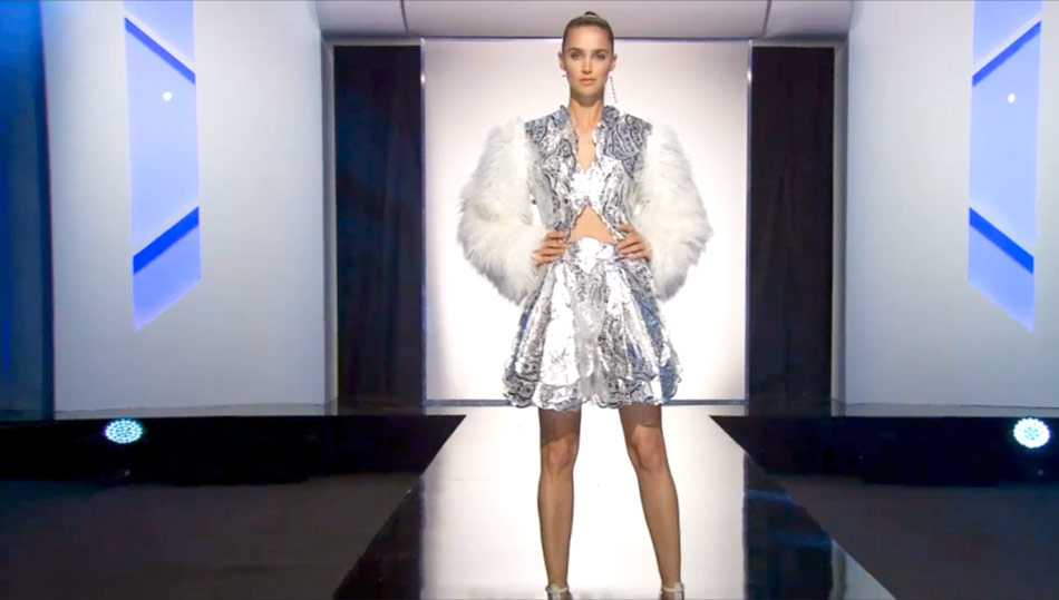
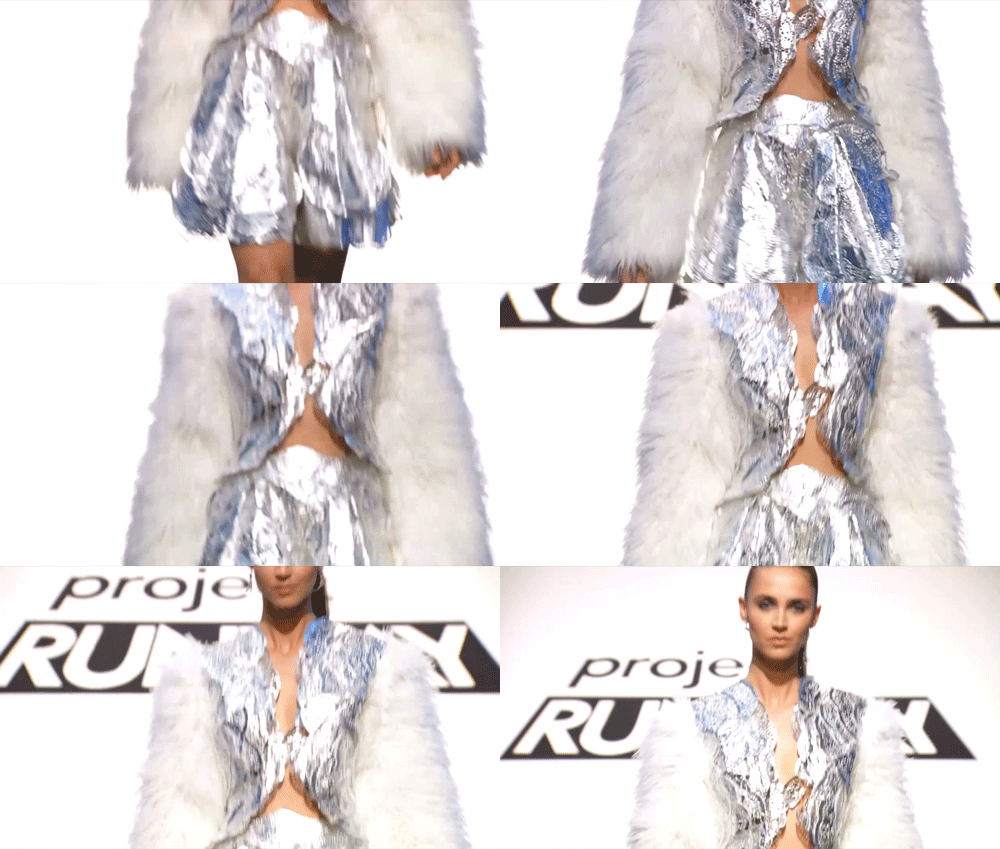
Nathalia is probably lucky hers didn't come back for closer inspection, because it looked in one shot like the vest bodice was coming apart a bit.
But I agree that it was beautiful and interesting AND daring. As long as we're mentioning safe looks we thought deserved more: Mah-Jing's crumpled magazine dress! I loved how the randomness greated a print, and for being made of paper, it really looked wearable.
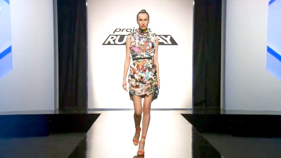
I also enjoyed Mah-Jing's. That it had such depth but didn't bulk up the model is really something. But I guess you can't look at everything when you start with, like, 92 designers. Any you thought shouldn't have been safe? I thought Linda's was nearly as boring as Ian's, and less flattering.
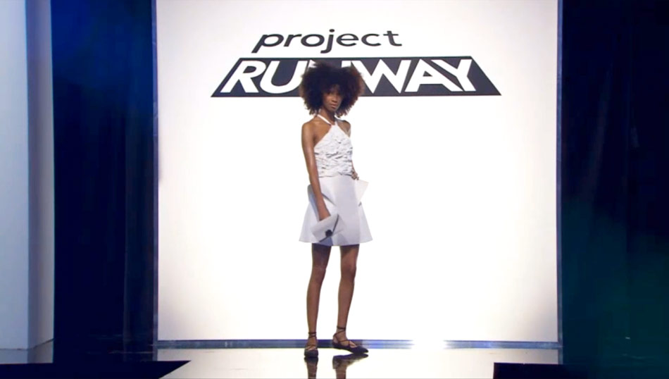
I agree. The fact that it was all white obliterated any potentially interesting details. It's unconventional materials; if you're not going to mix things up with colour, do SOMETHING with texture or proportions. At least hers, unlike Ian's, was well constructed -- as it should be, since there was kind of nothing to it.
How about the controversial glitter pants? That was shades of Duncan from Season 14: all the designers think it's a winner; all the judges are bored. Where did you come down on them? (I thought the execution was only okay, but they did literally make me smile when they walked, and I was relieved Brik made it through the bottom two: even if they weren't perfect, at least they showed he had ideas.)
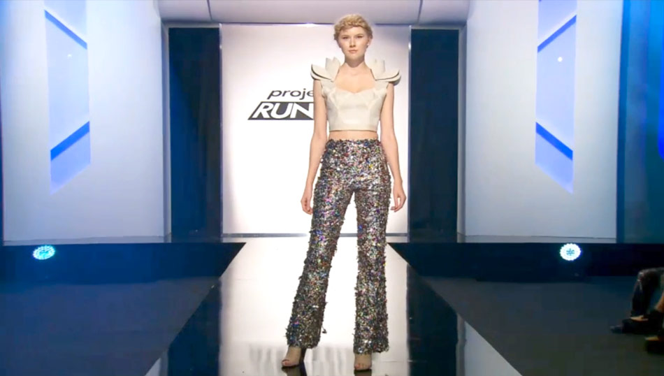
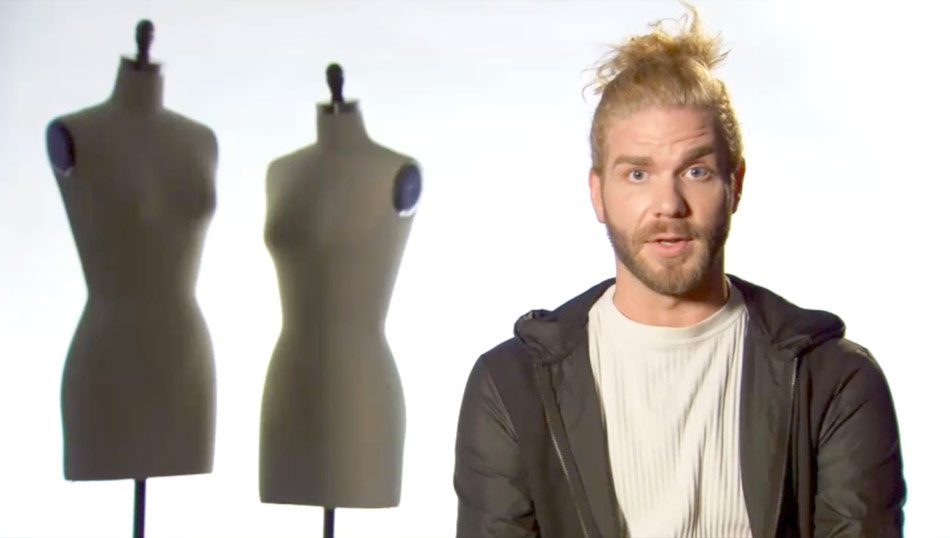
I agreed with the judges on Brik, that the two halves of the look didn't go together. And yeah, the pants are costume, and too short, and not all that innovative in strict terms of design; it's just gluing glitter on muslin. But he (and his model, hee) did that to perfection, and it didn't even look like they were shedding too much unicorn while they were walking. I'm not sure he has the sophistication to make it to a final, but I'm glad he got saved. Also I respect his manbun game.
My other out-of-the-top fave was Cornelius's paper plate petal dress. Sometimes a somewhat stiff material like that can make the model look like she's in a robot costume, but I thought his looked cocktail-party ready; to me it was more editorial than any of the top looks.
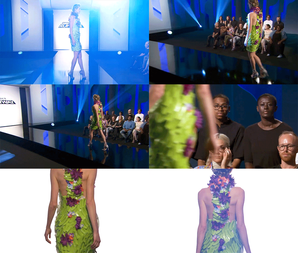
I dug that too, especially the back. Maybe he didn't use enough different materials? Sometimes the judging moves the line on this particular challenge according to what they respond to, versus any actual brief they're obeying. Speaking of which, what'd you think of our guest judge, Savannah Guthrie? Kind of a snoozer for a season premiere, I thought.
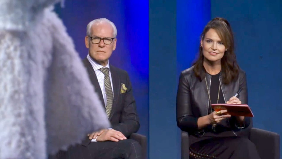
Such a snooze I forgot she was even there! I appreciate that she's a superfan of the show, but she's hardly someone who's known for her personal style. Then again, the scenes from future episodes promise Emily Ratajkowski, and she's best known for not wearing clothes at all.
Roberi's model can probably relate, hee. I did like that dress, though.
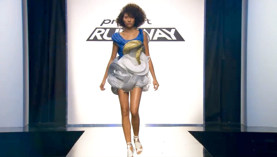
I did too! I thought it was judged really harshly; I liked the architecture of it, and to me the swirls were very graceful and intentional. I'm sure she couldn't sit in it, but sit-soundness isn't generally a consideration in this challenge, so who cares. Standing, it was pretty.
Word. Also pretty standing: Heidi fucking Klum, who I swear to God looks better every season. Her snacking on fondue while everyone was rushing around was everything. "So this is just going to sit here uneaten? Nein."
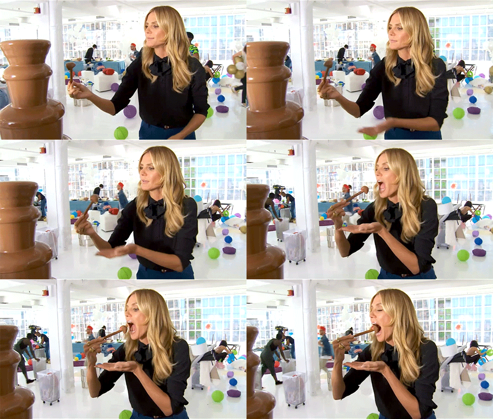
Heidi's the best, and sometimes when she gives her critiques -- always bringing it back to what she can imagine wearing herself, as opposed to some bullshit "fashion" standard -- I am reminded of how rough she was in those first couple of seasons. She's really come into her own as a host and judge, and I'm always happy to see her again.
Me too. And the man, the myth, the emoji, Zac Posen.
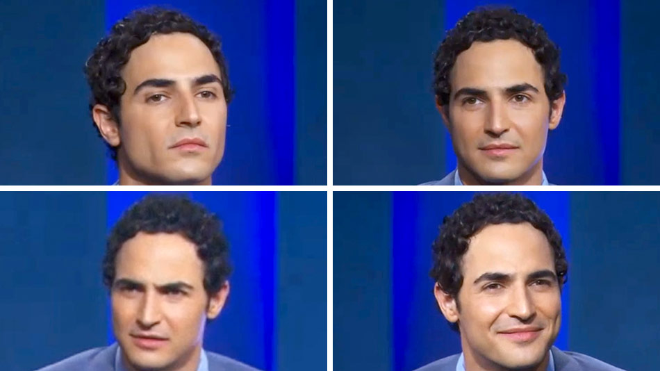
A thing of beauty and a joy forever. Welcome back, Señor Prettysmile.
Yeah, between our old "friends" and Tasha calling Tim Gunn "boss man," I think we're going to have fun this season.