Lifetime
Project Runway Gets Industrial For The Avant-Garde Challenge
As the designers use hardware to create this week's looks, who fails to meet the (industry) standard? Your editors discuss!
Our Players
The Talk
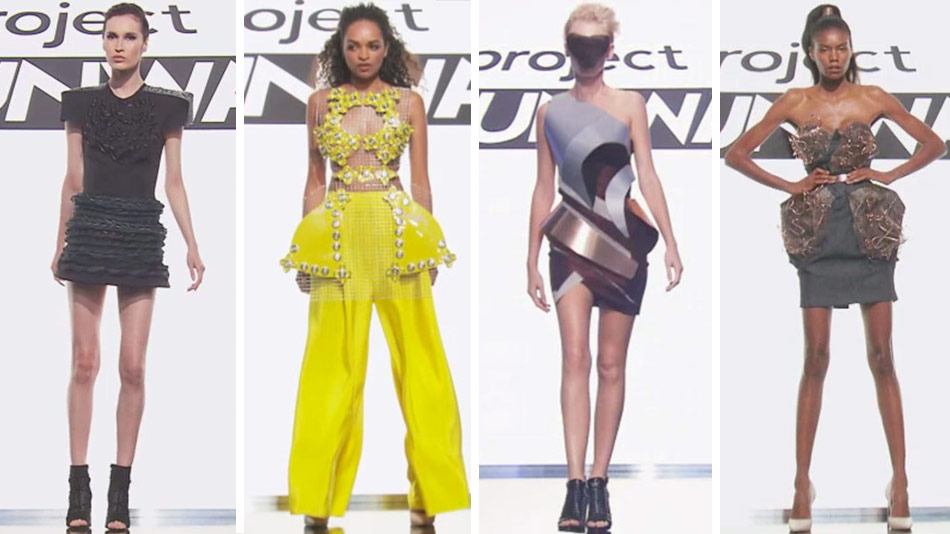
Tara, I'll try to keep my customary avant-garde rant short, in honor of your birthday week -- and the fact that you don't want to spend the ENTIRE rest of it listening to me bitch and moan about Project Runway's endlessly variable, and therefore utterly pointless, "definition" of the term. But here is what the dictionary tells me it means: "new and unusual or experimental ideas, especially in the arts, or the people introducing them." Exactly two of tonight's looks qualified; Mah-Jing's was not one of them, and I like him a lot, but I'm fine with his going home. You?
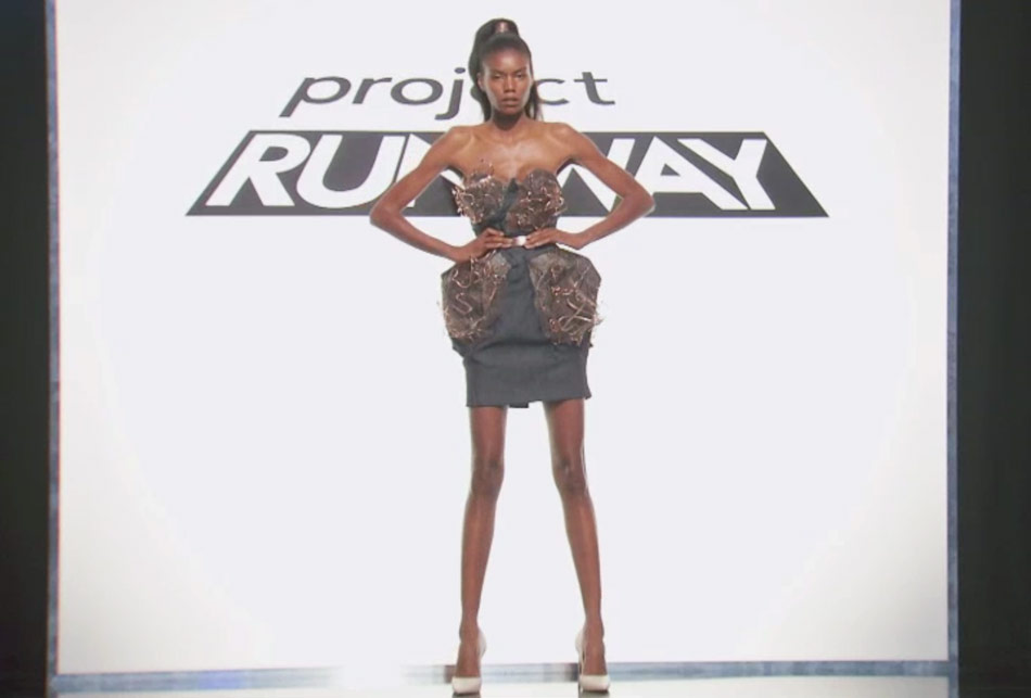
Mah-Jing, once again, falls into the trap of thinking that using denim to make a garment that's not jeans is automatically an innovation. At this point, it's not even unexpected coming from him -- he just did that with the denim panels on tweed in the last challenge! So yes, I'm fine with him getting auf'd this week, and it seemed like he was too, which always makes the cut of a personally likable contestant easier to take; his closing remarks about making peace with his mom made me think he was relieved he wasn't going to be expected to come up with a whole collection for Fashion Week when he's already creatively tapped out. But NOW I need to know which two looks you thought did meet the brief and see if we agree!
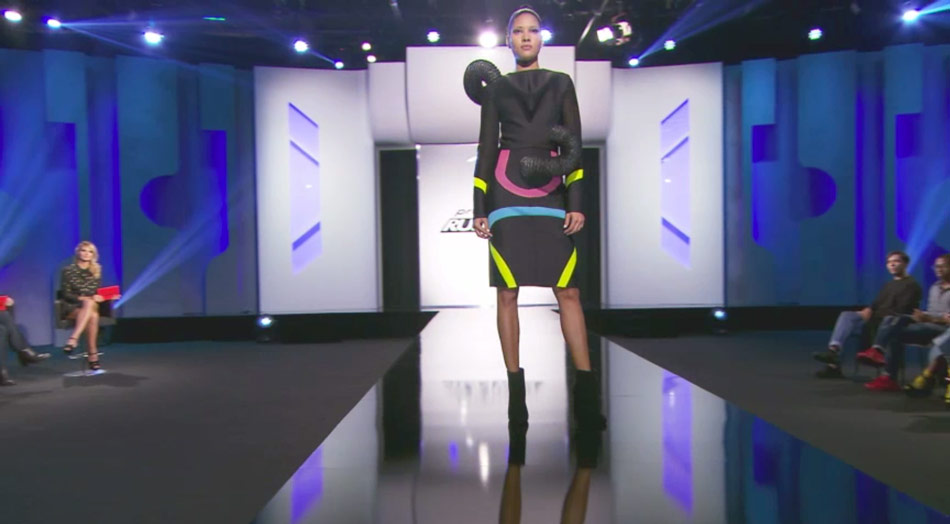
Cornelius and Erin. Cornelius's looked like a TNG cosplay, but I didn't hate it, and at least he had an idea. It was a fucked-up idea? But it was an idea. I wish he'd pushed certain elements further, like the neon, and the tube placement was bad, but at least it didn't look like a dick anymore.
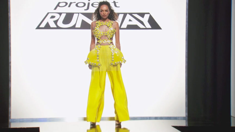
Erin's...I mean, part of me feels like "difficult and ugly" isn't automatically avant-garde either; I didn't see her paper-doll idea in the finished product, and she should have gotten clocked for shitty finishing if they were going to bag on Mah-Jing for the same thing.
But it didn't mistake grommets for the cutting edge of fashion arts, at least.
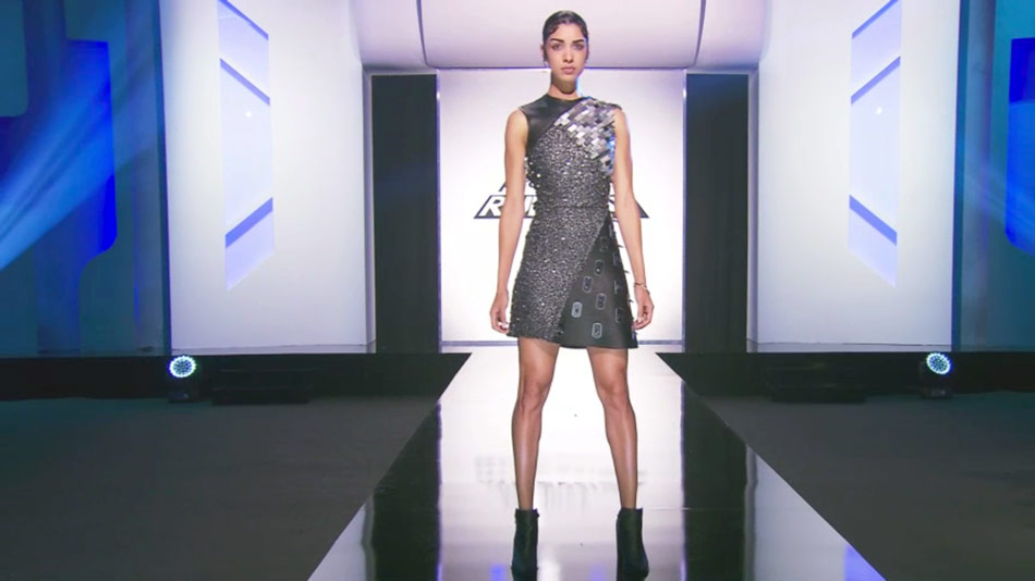
Rik.
Not to re-litigate, pointlessly, the issue you led off with, but...YES, there needs to be more specificity about how wearable a look is supposed to be while still qualifying as avant-garde, because could Erin's model have even sat down in that cage? Yet Erin won.
I'm with you on Cornelius -- I appreciated guest judge Shiri Appleby admiring that strong shoulder, because even though I personally am against asymmetry, she's right that it can give a lot of drama to a look (and irrespective of body type, which I always like too). But she was also right that ending the tube at the pooch is an unfortunate choice. I would have given the second legit avant-garde slot to Roberi, though now you're making me think I just let myself be tricked by the mask his model wore on the runway.
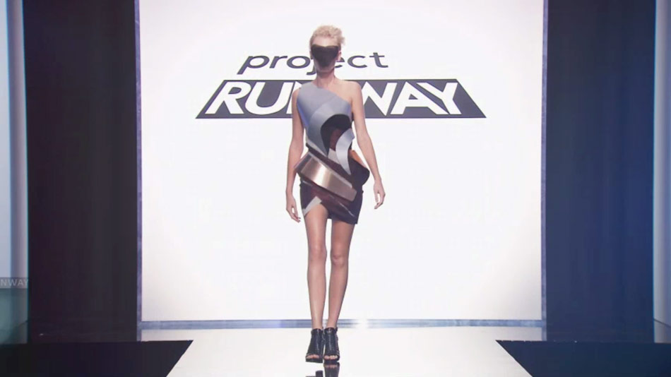
I did like the mask, but I didn't see how Roberi's broke any new ground, versus being merely harder to wear than most dresses. I did enjoy the color combo, which felt new and not so sci-fi as some of them, but here again was finishing that looked poor to me, especially for a two-day challenge, at least as poor as Mah-Jing's.
I guess? I thought Roberi's metal panels at least looked sharper than Mah-Jing's coral peplum idea. But this leaves us with one last designer to discuss, and that is Ms. Laurence Basse. Does she fall silent at critique because she's uncomfortable in English? Or was she, this week, aware that she walked something so-so? Because I kind of think she should have been in the bottom instead of Cornelius. Her look was boring.
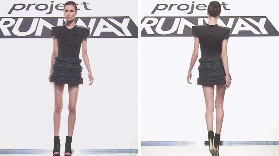
Given that, after she switched to French, she said exactly what she'd just said in English...I don't know. She's like Anya, not in skills -- Laurence actually, you know, has some -- but in the sense that she probably gets by with more than she should thanks to a personal flair that the judges should try harder to separate from her work.
This is also not the first look she's sent down that was far too short, and the sad thing is, if she'd taken the steps idea further -- built it down and out more, used treads, anything -- it would have been the best thing there. As it was, it's kind of like her: gorgeous, stylish, inert.
We're used to Heidi dismissing looks by saying that she wouldn't wear them. But Zac telling Shiri that he wouldn't let HER wear it was a new level of devastating, and I was HERE for it.
And she's teeny; it might even be the right length for her. Did you agree with Zac letting her wear Rik's? I didn't think that was avant-garde but it was awfully pretty.
I think Shiri in Rik would be just fine for a sub-Emmy award show: it would be interesting enough to make her look edgy and youthful, but not so outré that she'd be embarrassed to let her kids see her in it. Though I wouldn't recommend them hugging her in it. That...would hurt.
That's a great way to get out of babysitting, now that you mention it. "Watch the kids for an hour? Sure, let me just slip into something less comfortable."